After spending a lot of time in understanding how to build Responsive HTML email templates that are suitable for multiple client types, I learned about how email works and the problems that developers face when building HTML email and how one can achieve that. Here are some points that may help aspiring HTML email Developers.
Email design and development is a beast. Email client vendors haven’t been as progressive as web browser vendors in adopting new standards.
Building HTML email templates can be a slog. As a result, a lot of poorly designed email is out there — clunky, themed, verbose, pointless, distracting. If you enjoy a challenge or want a unique look and feel, then building your own can be fun and rewarding.
Most of the Email Clients removes <html> and <head> tags from your HTML template when you paste your code in WYSIWIG Editors. They will only render the data that is available in <body> tag.
Email clients use different engines to render HTML emails:
As part of strategic initiative, CloudDataWorld started its new platform for domain, hosting and cloud products.
Check out CloudDataWorld’s Shared Hosting plans.
- Apple Mail, Outlook for Mac, Android Mail and iOS Mail use WebKit.
- Outlook 2000, 2002 and 2003 use Internet Explorer.
- Outlook 2007, 2010 and 2013 use Microsoft Word(yes, Word!)
- Web clients use their browser’s respective engine (for example, Safari uses WebKit and Chrome uses Blink).
Clients will also add their own flavour of styles on top of yours. For example, Gmail sets all <td> fonts to font-family: Arial, sans-serif;
We need to use HTML tables to for layout design:
Divs have positioning and box-model issues in different clients — in particular, those that use Microsoft Word to render (i.e. Outlook). You can use divs if you want, but it’s safer to code like it’s 1999 and stick to tables. This means:
- <table> instead of <div>,
- #FFFFFF instead of #FFF,
- padding instead of margin,
- CSS2 instead of CSS3,
- HTML4 instead of HTML5,
- background-color instead of background,
- HTML attributes instead of CSS,
- inline CSS instead of style sheets or <style> blocks.
- Add “role: ‘presentation’” to each table you use, so that it is clear the table is used for layout.
Inline CSS:
Some clients (most notably Gmail until recently) will strip any CSS that isn’t inlined. You have a couple of options here:
- Write Inline CSS as you go
- Use web-based CSS Inliner
Writing inline as you go isn’t exactly a scalable or maintainable solution, so I tend not to recommend this, but I know that a lot of email developers prefer this in order to maintain 100% control. But I personally recommend using web-based inliner tool which I mentioned above.
Buttons:
Trying to achieve the perfect cross-client button is painful. As mentioned, you should be using tables and table cells for pretty much everything, including buttons.

My preference is to use the following solution. Here is how you might normally style a button for the web:
Instead write like this:

Conditionals:
We can apply specific CSS styles and show or hide elements and content for different versions of Outlook.
The following targets all Microsoft Word-based versions of Outlook:

The next snippet targets all IE based versions of Outlook:

Images and Media:
Some clients will show images by default. Some won’t. Keep this in mind when including images in your email content. This also affects tracking metrics, because images will typically be used to track opens.
- Outlook blocks image rendering by default
- Apple mail and Gmail won’t
Remember to include “alt” text to your image as it helps user understand what the specific image is about even if it isn’t rendered (For Example: “Company Logo”). You can also be creative with your “alt” text to make it look like the image in few cases.
And remember to include basic reset for all images and always source image using URL.
Animated GIFs are supported by most of the clients, but versions of Outlook 2007-2013 do not support them, instead shows the first frame.
For Outlook, you need to declare how wide an image must be using width attribute. Otherwise outlook renders actual width of the image and breaks your email.
Video is supported by many clients. You can use media queried to show or hide video based on the client type.
Forms in Email:
Support for forms varies. Staying away from forms is safer. If it is mandatory to use form in your email, I recommend linking to an external form in another webpage.
PreHeader Text:
Something important but often forgotten is preheader text. Some clients show preview text next to or under the subject line. These clients include iOS, Apple Mail, Outlook 2013, Gmail and AOL.
Clients will grab the first bit of text they find in your email’s body and display it here. Make the most of this and add a hidden element to your body’s content that appears first. This text should provide an extra incentive for the user to open your email.
Icons in Email:
As I mentioned at the beginning, Email Clients removes <head> tag, so one cannot render icon fonts. I suggest avoid using Icons (such as “font-awesome icons). Instead of those,
replace them with images (icon.png).
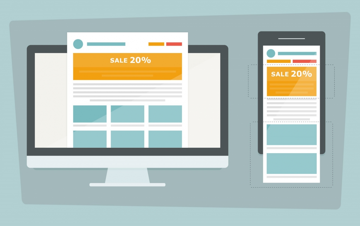
Responsive Emails:
Email opens on mobile are at 50% and rising. The exact metric depends on which report you check and which audience you cater to, but I think we can all agree that this is important.
We can use CSS3 media queries to achieve responsive emails for mobile clients. There are several techniques to achieve this. They are: “fluid,” “adaptive,” “responsive,” “hybrid” and “spongy.”

Fluid:
This is the easiest solution to stick to a single column. Which means when viewport shrinks, content area shrinks.
Responsive and Adaptive:
Using media queries and breakpoints, we can control alternate styles for different elements and can even show or hide elements.
But as we knew media queries are not supported, this won’t work until you use web-based inliner tool.
Hybrid and Spongy:
This technique uses a bit of fluid, a bit of responsive and a couple of hacks for Outlook support. We also get to ensure that the columns stack without media queries.

Testing Email:
I don’t think I’ve ever sent an email successfully the first time. There is always something to fix, always a typo, always a rendering issue in Outlook, always something I’ve forgotten to add.
You can test your email in a few ways:
- Send an email to yourself and check it on a desktop client (Outlook), a web client (Gmail) and a mobile client (iOS Mail).
- Automate tests using Litmus or Email on Acid.
- Proofread the content and check the layout renders.
Conclusion:
Email design and development is a beast. It is a lot like building a web page… 10 years ago. Email client vendors haven’t been as progressive as web browser vendors in adopting new standards, and we users and companies don’t adopt new email clients like we do with web browsers. Add to that the rise of mobile, and we’re left in this state of having to support a convoluted mix of clients and versions.


Comments